New Icon Design System in MyNetDiary
- 1 Minute Read
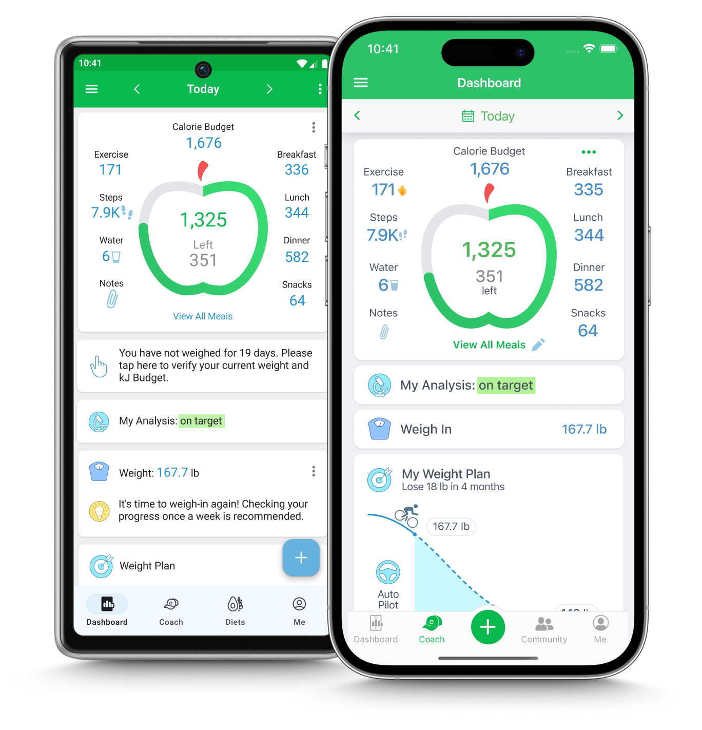
After six months of work with Stefan Dziallas @ iconwerk, we released in August 2023 the new icon design system in MyNetDiary apps, first for iOS and recently for Android. Now you see the latest icon work in your MyNetDiary app, and we hope you like the new design as much as we do.
Our new icon system has been designed by our in-house design team together with Stefan Dziallas @ iconwerk. iconwerk has specialized in custom icon design since 1999. You may have used some of the icons made by iconwerk before if you used Skype, Klara, Microsoft Teams, Cisco Webex, meta Workplace, KAYAK or just bought a Philips TV or Bang & Olufsen TV. Or if you visited Tiffany.com. Now you see the latest icon work in your MyNetDiary app and we hope you like the new design as much as we do.
Our existing icons were developed over many years, and gradually, the style became not only outdated but also a bit chaotic. We wanted to create a modern, consistent icon style in our app.
Secondly, we wanted a nice, calm style that does not attract too much attention to the icons themselves. The app is used many times daily, and the icons play a supporting role in our app, as all icon actions are labeled with text, too. The icons should be balanced with the text and data in the app.
We were long-time admirers of iconwerk designs by Stefan Dziallas and, over the years, used many products and applications with his icon designs. We were fortunate to connect with Stefan and get started with the project in January 2023.
For the first three months, we explored a wide range of design styles, experimenting with shapes and colors.
![]()
![]()
![]()
Here is the design evolution of several key icons in our app:
![]()
Eventually, we settled on the circular shapes, keeping many original idioms but implementing them in a monochrome scale and minimalistic style.
![]()
Next, we experimented more with colors, eventually choosing a pastel palette. We wanted to provide warm, gentle colors and avoid bright red, green, and yellow colors that the app uses to color code negative, positive, and warning situations.
![]()
After that, we developed a style for the dark theme, using the same symbols yet making black the dominant color, avoiding bright splashes of color on black screen backgrounds:
![]()
As the final step of the redesign, we updated all other supporting icons in the app - both monochrome and colorful, to use the new idioms (where changed) and consistent line styles.
![]()
Overall, we updated over 300 icons in the app. The new design was released in August 2023 and was well received by our users - while radical in style, it seemed organic and evolutionary to the users, as if it was always meant to be that way.
![]()
![]()
From App Store user review, August 28, 2023
I have tried almost every calorie/macro tracker on the App Store (MFPal, Lose It, Cronometer, Lifesum, Fat Secret, Oatsy, etc.) and MyNetDiary is clearly the most complete, most beautiful, and most user friendly out of all of them. Period.
We do hope you like the new icon style in MyNetDiary as much as we do!

